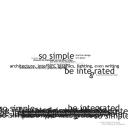
Letter Clutter Aug 21st, 2007
It seems I have been concentrating a lot on how to create a composition without using pictures. I find myself exploring new ways of creating texture, patterns, rhythm, and shape without placing that stock photo in from iStockPhoto. All of use have created a self portrait composed only of typographic characters. After perusing graphic design periodicals, we can quickly find that this is actually a great design trick to put in our pockets and not just a great classroom exercise.
When checking out at Borders the other day I found myself pulling out a gift card. I was delighted to find letter clutter or type characters placed in a collaged manor, to make a composition. What better application then for a bookstore gift card. The composition used letters to fade from candy red to a deep maroon. I have seen this trick used for many different solutions, and I have explored some myself only to find out a designer doesn’t need access to stock photos to make a successful design piece.
 The larger the type the more important it is. When experimenting with type as design, I quickly realized what I was really doing was defining hierarchy. Take a quote for example; In any given quote their are areas of emphasis. We can bring these forward by enlarging the type, changing the color, reversing it out, or even changing the direction or organization of the type or by putting letter clutter behind it. There is not one solution to letter clutter. In every piece there can be a little, or much letter clutter used to achieve the final idea.
 David Carson has mastered this. He is a great example of what is called kinetic type. While kinetic type technically means types that is moving and showing energy, I think that David has found a means to do this in a static sense. Perhaps this is the most intriguing thing about letter clutter. The characters come more alive then ever before. We can take the standard Times New Roman and give it a whole new meaning and personality just by how we place it on a page. Letter clutter is another design trick that I have taken too. It may not be applicable to every design and can become over used, but it can be a great solution when used in a controlled manor.

 Muse
Muse

 View All